
It's almost the end of January and I am just posting my first layouts.....aaaach! I spent Friday evening and all day Saturday scrapping with a great bunch of gals at a crop organized by Barb P. (http://albumstoremember.blogspot.com/). We had a fantastic time and I feel that I got a fair bit accomplished in between the chatting and the visiting and the shopping and the eating! lol
"Hats" was one of the sketch challenges that I completed. The yellow base is patterned paper from K&Co., die cut patterned paper is Cosmo Cricket. I made the scalloped edge border using my corner rounder, then added the ric rac for contrast. Cor'dinations card stock and a row of BoBunny buttons tied with CTMH Waxy Flax and a couple of hearts from Thelma (thanks!!) and a co-ordinating die cut from Cosmo Cricket at the bottom(thanks Tracey!) finished it off.
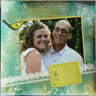
The next one doesn't really have a title but features a photo of my brother and his wife. I wanted to try one of Heidi Swapp's embossed papers....they start off totally white with some white embossed designs on them. You can paint, ink, chalk, etc to your hearts content.....I chose to spray with Glimmer Mists and love the look, but the paper did curl. Most times anything you mist will curl, then dry flat. I added some pearl accents from Zva Creative and an embellishment from Making Memories, paper ribbon from K&Co, journal spot from K&Company, and a few pearl opaques from Close To My Heart.


fantastic layouts Roz......2 down and I'm sure they will be followed by many with all the events and get togethers you have planned! Good stuff.
ReplyDeleteYour son seems like quite the character Roz!! The first layout is fun!! and the second layout is very pretty (: I love the colours you used, and the pearls and lace really add to it. To be honest, I haven't even started a layout yet!!! I guess I better got started this weekend!!!
ReplyDeleteI love both of these! I really like the placement of all the elements on the first page, and the bright colours! And the background paper on the second - stunning! I didn't know they had paper like that, very cool! I suppose I could try duplicating that with embossing powder, hmmm, now the gears are turning a mile a minute!
ReplyDeleteI was thinking the same as Jenn Joncas, your hats layout is so fun!!! I love all the buttons, they really pop! Your second layout is beautiful, I have to find some of that Heidi Swapp paper. I love the way it turned out!
ReplyDeleteI found that Heidi Swapp paper at Michael's this summer....they had 5 or 6 different ones....and they were kind of hidden away at the bottom of one of the paper "walls". All you could see was her name sticking out. Roxy, it would be so much easier just to pay the 99 cents for the paper...lol!
ReplyDeleteWill have to admit your son reminds me of my daughter - what characters :) Your pages are beautiful I love the Hats layout for how it all flows together. And the second layout is just PRETTY! Some how the picture seems made for that paper - Thats the sign of a great crafter I think :)
ReplyDeleteNice pages Roz !
ReplyDelete